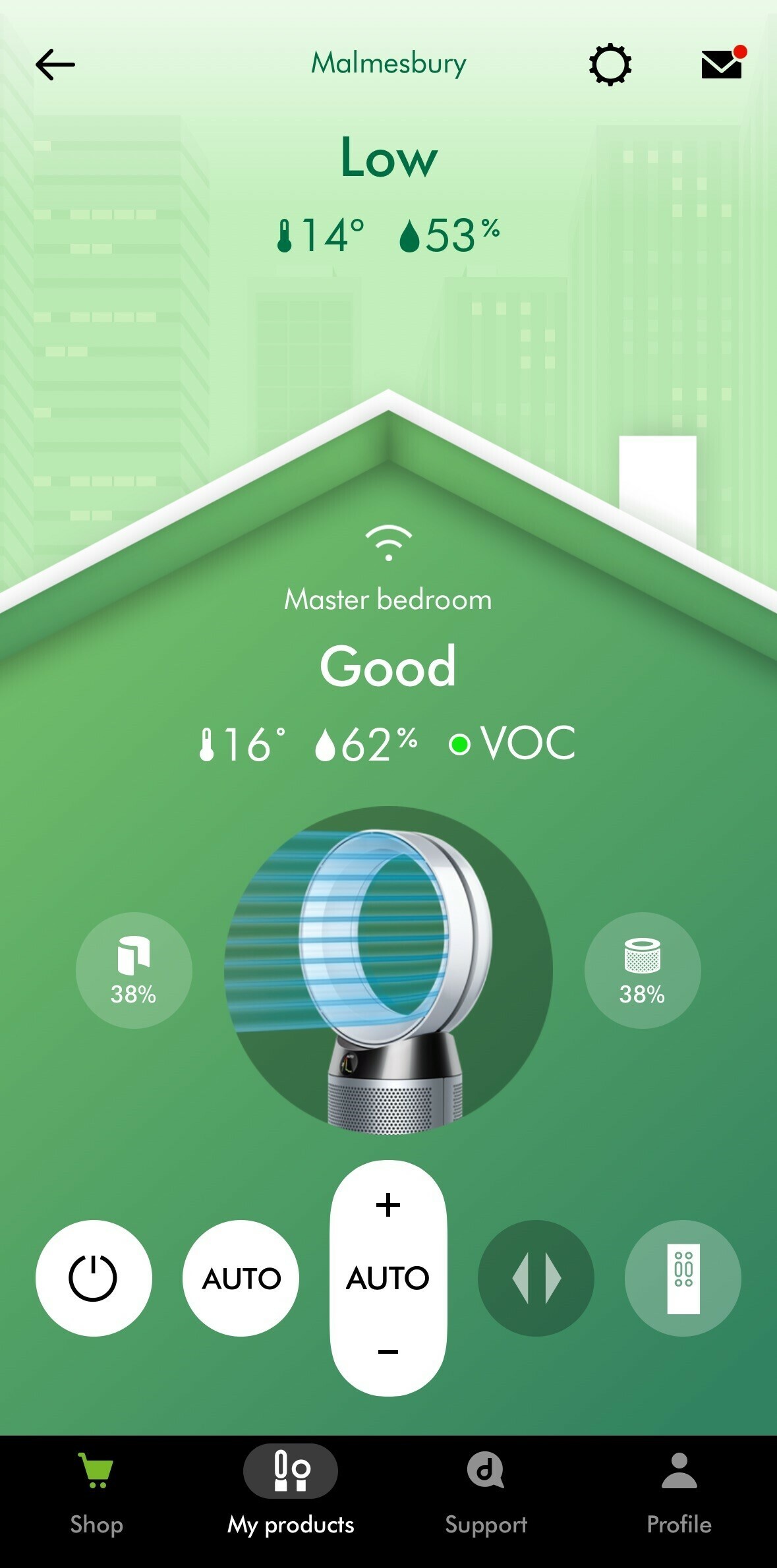
With the new update, they have removed an element that makes the application irritating to use. Before you could swipe from right to left or right to change from one device to another, now it takes two clicks to change. It's not a lot of clicks, but day to day it has an impact. In the new menu, we only have the choice to click on the top right to return to the list of devices. Clicking on my products at the bottom doesn't even show us the list when we are on a device. In the application's update note, they indicated: improved navigation. It's quite the opposite.
Reply
Create a Community account to start contributing.
New here? Register below. To activate you account and be able to post on the community, don't forget to click on the link in your activation email.
Login to the community
No account yet? Create an account
Enter your E-mail address. We'll send you an e-mail with instructions to reset your password.


